AI 網頁生成 - 第九篇附錄 - CSS指令集
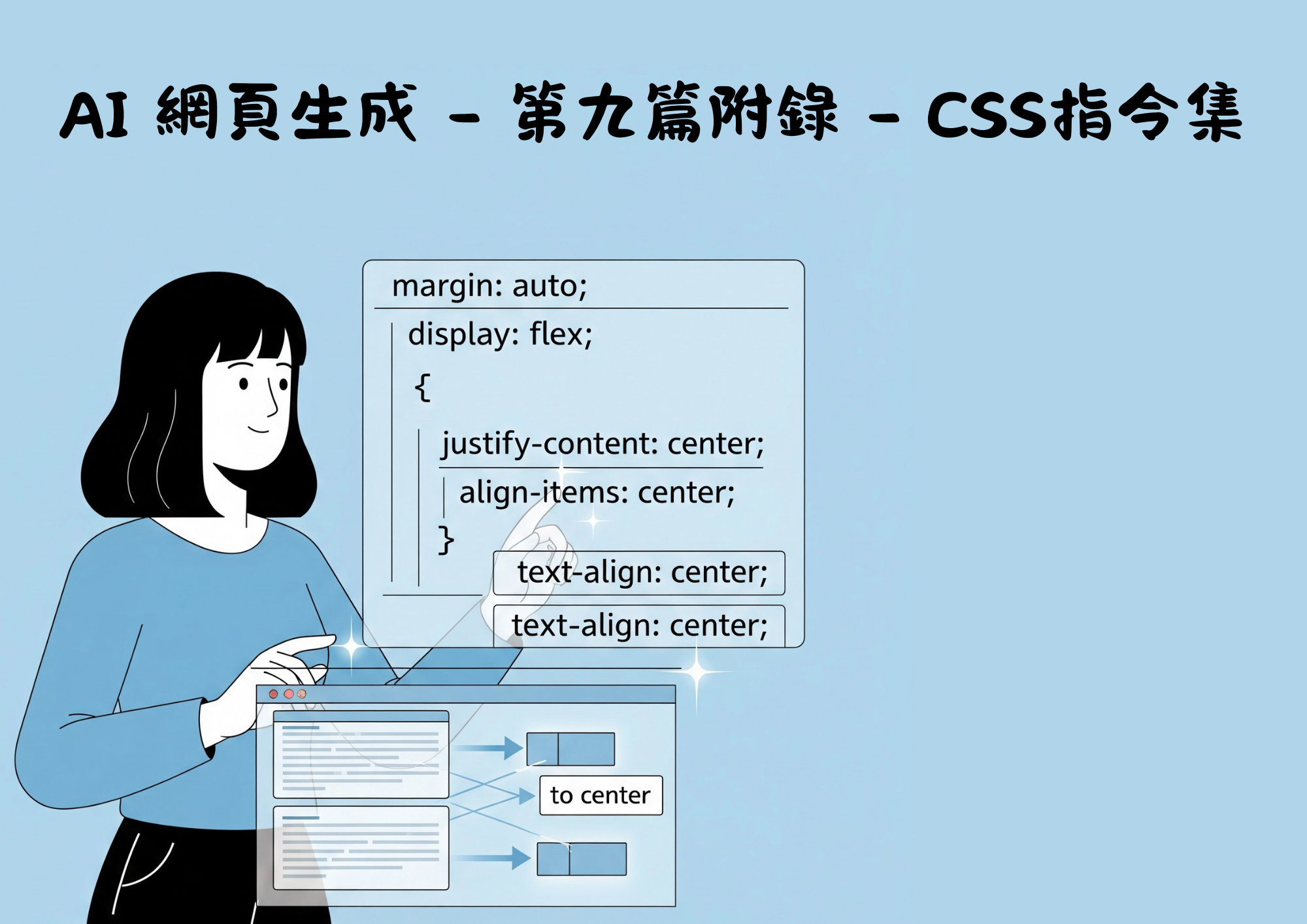
CSS 對齊與定位指令集
一、水平對齊(Horizontal Alignment)
- 使用
mx(margin-x)系列:
- `mx-auto` // 左右自動邊距,實現水平置中- `mx-0` // 左右邊距為 0- `mx-1` ~ `mx-96` // 設定不同水平邊距- `mx-px` // 左右邊距為 1px- `mx-0.5` ~ `mx-3.5`// 精細控制- `mx-0.5` ~ `mx-3.5`// 精細控制
- 使用
ml和mr:- `ml-auto` // 左邊距自動,元素靠右- `mr-auto` // 右邊距自動,元素靠左- `ml-0` ~ `ml-96`- `mr-0` ~ `mr-96`
二、Flexbox 對齊
- 主軸對齊(justify-content):
- `justify-start` // 靠左對齊- `justify-end` // 靠右對齊- `justify-center` // 水平置中- `justify-between` // 兩端對齊,中間留白- `justify-around` // 均勻分佈,兩端留白- `justify-evenly` // 完全均勻分佈
- 交叉軸對齊(align-items):
- `items-start` // 靠上對齊- `items-end` // 靠下對齊- `items-center` // 垂直置中- `items-baseline` // 基線對齊- `items-stretch` // 拉伸填滿
- 自對齊(align-self):
- `self-start` // 自己靠上- `self-end` // 自己靠下- `self-center` // 自己垂直置中- `self-baseline` // 自己基線對齊- `self-stretch` // 自己拉伸
三、Grid 對齊
- Grid 項目對齊:
- `justify-items-start`- `justify-items-end`- `justify-items-center`- `justify-items-stretch`- `items-start`- `items-end`- `items-center`- `items-stretch`
- Grid 內容對齊:
- `justify-self-start`- `justify-self-end`- `justify-self-center`- `justify-self-stretch`- `self-start`- `self-end`- `self-center`- `self-stretch`
四、文字對齊
text-left// 文字靠左text-center// 文字置中text-right// 文字靠右text-justify// 文字兩端對齊
五、實際應用範例
- 水平置中:
<div className="mx-auto w-64">置中內容</div>
<div className="flex justify-center"><div>置中內容</div></div>
<div className="grid place-items-center"><div>置中內容</div></div>
- 靠右對齊:
<div className="flex"><div className="ml-auto">靠右內容</div></div>
<div className="flex justify-end"><div>靠右內容</div></div>
- 垂直置中:
<div className="flex items-center h-64"><div>垂直置中內容</div></div>
<div className="grid place-items-center h-64"><div>垂直置中內容</div></div>
- 完全置中(水平+垂直):
<div className="flex items-center justify-center h-64"><div>完全置中內容</div></div>
<div className="grid place-items-center h-64"><div>完全置中內容</div></div>
六、垂直方向的 margin/padding 指令
- 垂直 margin:
- `my-2`:上下各 0.5rem 的 margin- `my-auto`:上下自動 margin(常用於 flex 垂直置中)- `mt-2`:上方 margin- `mb-2`:下方 margin
- 垂直 padding:
- `py-2`:上下各 0.5rem 的 padding- `pt-2`:上方 padding- `pb-2`:下方 padding
七、垂直對齊(flex/grid)
- Flex 垂直對齊:
- `items-center`:垂直置中(flex 容器用)- `items-start`:靠上對齊- `items-end`:靠下對齊
- Grid 垂直對齊:
- `items-center`:垂直置中- `items-start`:靠上- `items-end`:靠下
八、單一元素自對齊
self-center:自己垂直置中self-start:自己靠上self-end:自己靠下
九、響應式前綴(sm:、md: 等)補充
Tailwind CSS 提供多種響應式設計的前綴類別,可以根據不同螢幕尺寸套用不同的樣式:
sm::適用於小型螢幕(min-width: 640px)(通常為預設)md::適用於中型螢幕(min-width: 768px)lg::適用於大型螢幕(min-width: 1024px)xl::適用於超大螢幕(min-width: 1280px)2xl::適用於極大螢幕(min-width: 1536px)
十、總結與小提醒
- 垂直間距:
my-*、mt-*、mb-*- 垂直對齊(flex/grid):
items-center、items-start、items-end- 單一元素自對齊:
self-center、self-start、self-end
分享這篇文章:
相關文章

AI網頁設計 - 第二篇 : 讓 AI 幫你設計網頁

AI 網頁生成 - 第四篇:靠 AI 目前還做不好用戶登入流程?

AI 網頁生成 - 第十篇:測試與修正錯誤

AI 網頁生成 - 第五篇:什麼是 Authgear?

AI 網頁生成 - 第三篇:AI 生成的網頁設計結果
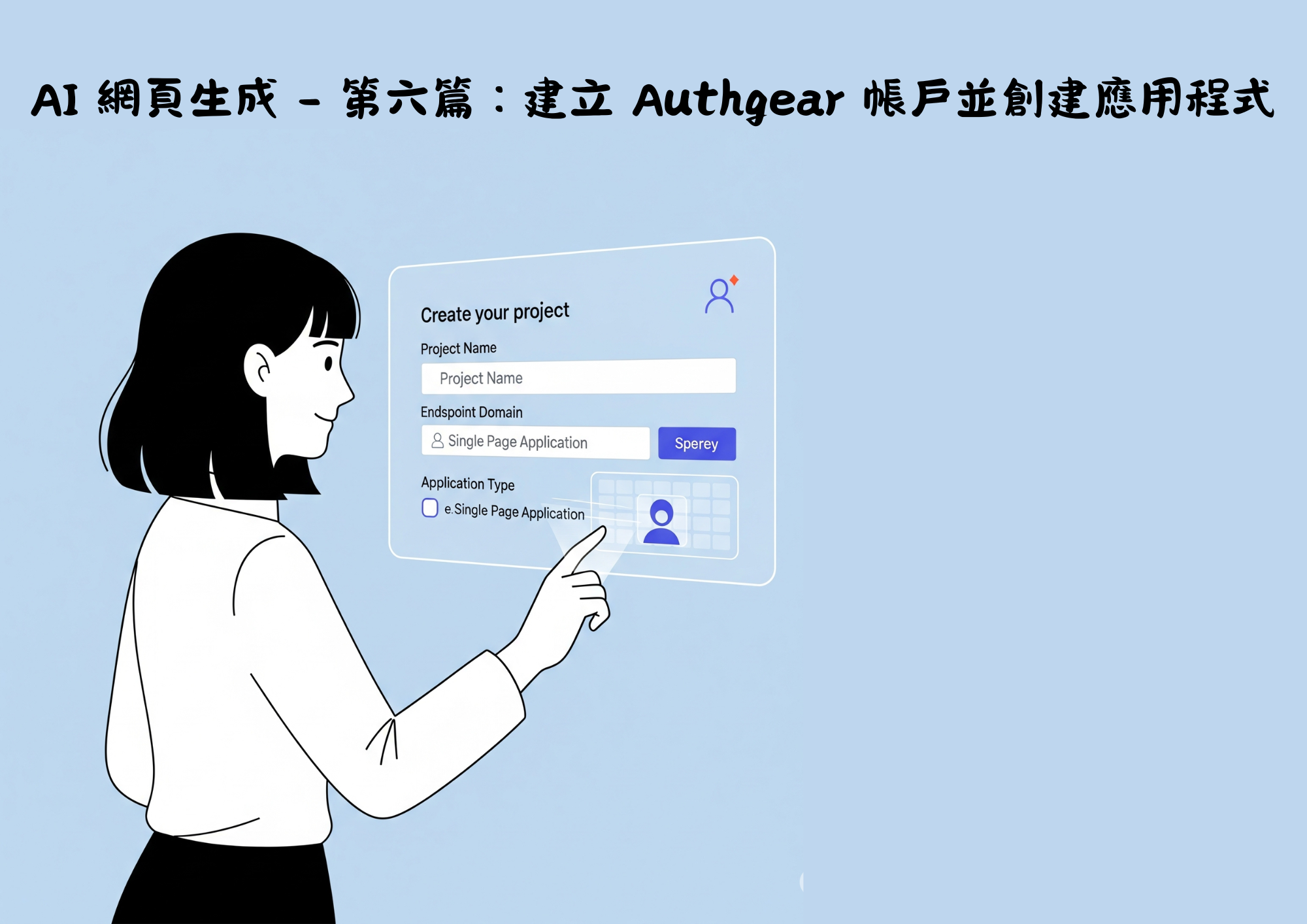
AI 網頁生成 - 第六篇:建立 Authgear 帳戶並創建應用程式

AI網頁設計 - 第一篇 : 首先要先有個點子

AI 網頁生成 - 第十一篇:將你的網站部署上線

AI 網頁生成 - 第九篇:手機與桌面版頁面調整
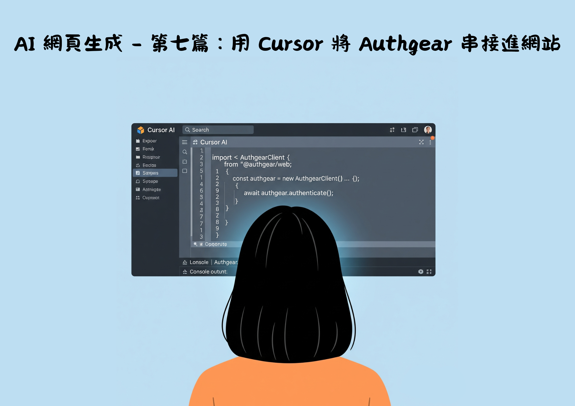
AI 網頁生成 - 第七篇:用 Cursor 將 Authgear 串接進網站